
While digital advertising dominates today’s marketing landscape, Printed Ads continue to hold a unique and powerful place in capturing consumer attention. In a world saturated with fleeting digital content, the tangibility and permanence of printed ads offer a refreshing and impactful alternative. The best printed ads are not just visually appealing; they are masterpieces of concise communication, capable of leaving a lasting impression through static visuals and carefully crafted copy. Many of history’s most iconic and effective advertising campaigns have utilized print, shaping the industry and setting benchmarks for creative excellence.
Drawing inspiration from successful billboard advertising and timeless advertising campaigns across all media, this curated collection showcases some of the most compelling printed ads from various decades. These examples demonstrate the enduring power of printed ads to cut through the noise, connect with audiences, and drive brand recognition.
1. Volkswagen: Think Small, Think Different
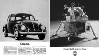 VW advert from the 1960s a VW car and a spaceship
Volkswagen’s “Think Small” campaign, crafted by Doyle Dane Bernbach (DDB) in the 1960s, revolutionized advertising. These printed ads were groundbreaking for their concept-driven approach and injection of humor. DDB cleverly connected with everyday consumers by acknowledging relatable issues and even playing on the Volkswagen Beetle’s perceived shortcomings – its small size and affordability compared to more glamorous cars of the era. The genius lay in the simplicity: stark visuals paired with punchy, memorable copy. Slogans like “Think Small” and “Lemon” (used ironically to highlight minor imperfections as a testament to quality control) became iconic, proving that printed ads could be both witty and persuasive. This campaign demonstrated the power of printed ads to build brand identity by embracing authenticity and relatability.
2. Apple: Simplicity is the Ultimate Sophistication
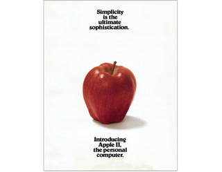 Apple
Apple
Apple’s advertising has long been synonymous with minimalist design and subtle humor, and this printed ad from their 1977 marketing brochure for the Apple II computer perfectly embodies that ethos. Strikingly, the printed ad features no product imagery at all. Instead, it relies on a stripped-back aesthetic and minimal text. The inclusion of the quote, “Simplicity is the ultimate sophistication,” often attributed to Leonardo Da Vinci, served as more than just a tagline; it declared Apple’s core philosophy. Coupled with the bold claim that the Apple II would be “the” personal computer, this printed ad used elegant simplicity to convey confidence and innovation, hallmarks of the Apple brand that continue to resonate in their printed ads and overall marketing strategy today.
3. Nilkamal Plastic Chairs: Strength Illustrated
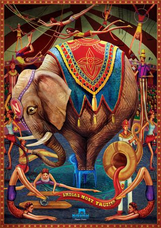 Print adverts: Nilkamal
Illustration can be a remarkably effective tool in printed advertising, adding a layer of artistry and conceptual depth. This printed ad for Nilkamal plastic chairs is a prime example. The central image of an elephant standing confidently on a single Nilkamal chair instantly communicates the product’s key benefit: exceptional strength and stability. The intricate illustration style and vibrant colors further enhance the visual appeal, elevating the printed ad beyond a simple product showcase. Created by Makani brand communications agency, the printed ad cleverly includes a subtle detail – the hint of apprehension in the elephant’s eye as it balances on the chair, adding a touch of humor and humanizing the powerful visual. This printed ad demonstrates how illustration can transform a functional product into a compelling visual story in print.
4. Penguin Books: Audiobook Headphones
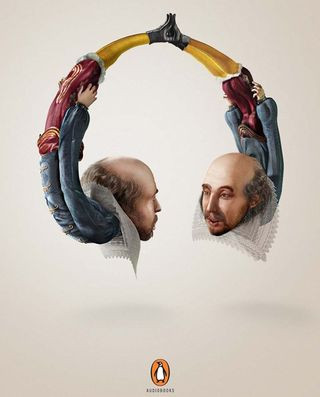 Print adverts: Penguin Books
Penguin Books masterfully employed printed ads to promote their audiobooks with a campaign that is both clever and visually arresting. The printed ad features illustrations of three literary giants – William Shakespeare, Mark Twain, and Oscar Wilde – ingeniously shaped to resemble headphones. This visual metaphor brilliantly conveys the idea of these authors whispering directly into the listener’s ears, promising an intimate and engaging audiobook experience. Developed by McCann India, this printed ad campaign was recognized for its creative excellence, winning a Gold Press Lion at the Cannes International Festival of Creativity. It exemplifies how printed ads can use visual wit and strong conceptual thinking to promote even intangible products like audiobooks.
5. SANCCOB: See the Reality
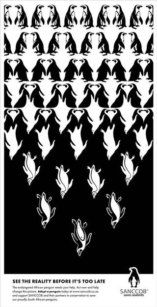 Print adverts: penguin
Inspired by the mind-bending artwork of M.C. Escher, these printed ads for SANCCOB (Southern African Foundation for the Conservation of Coastal Birds) utilize clever optical illusions to draw viewers in and convey a serious message. The printed ad campaign features seemingly playful illustrations that, upon closer inspection, reveal disturbing realities about environmental threats faced by penguins and other seabirds. The optical illusions serve as a metaphor for hidden dangers and the need to look deeper to understand the full picture of conservation challenges. While some images contain mature themes, the cartoonish style maintains an engaging and slightly unsettling tone. This printed ad campaign demonstrates how optical illusions in printed ads can be used to create impactful and thought-provoking messages for non-profit organizations.
6. Wacom Bamboo: Creativity Has No Boundaries
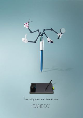 Print adverts: Wacom
To promote Wacom’s Bamboo series of design tablets, this printed ad campaign, spearheaded by art director and illustrator Maria Molina, embraces the tagline “Creativity has no boundaries.” The printed ads themselves visually embody this idea through a series of illustrations that reimagine design tools with unexpected and imaginative functionalities, reminiscent of Inspector Gadget’s inventive gadgets. The campaign’s success lies in its vibrant color palette, minimal text, and simple yet impactful graphics. These elements combine to create printed ads that are both visually appealing and effectively communicate the boundless creative potential unlocked by Wacom’s products. This printed ad campaign illustrates how visual creativity can be used to promote creative tools in print.
7. Schusev State Museum of Architecture: Discover the Full Story
 Print adverts: Schusev State Museum of Architecture
This beautifully illustrated printed ad for the Schusev State Museum of Architecture in Moscow, crafted by Saatchi & Saatchi, uses striking imagery to entice viewers to delve deeper into the history of Russian architecture. The printed ad features a captivating illustration of St. Basil’s Cathedral, cleverly extending the landmark’s image below ground level to reveal hidden foundations and untold stories. The tagline, “Discover the full story,” reinforces this concept, promising visitors a comprehensive understanding of Russia’s architectural heritage. The printed ad campaign utilizes a series of photographs of famous Russian landmarks presented in a similar style, all emphasizing the hidden depths and rich history waiting to be explored at the museum. This is a prime example of how printed ads can use visual storytelling and intriguing imagery to promote cultural institutions.
8. Fevikwik Instant Adhesive: Sticky Ad
 Print adverts: Sticky ad
Ogilvy, renowned for producing some of the world’s best printed ads, created this exceptionally clever campaign for Fevikwik Instant Adhesive. This printed ad, part of a three-part series, showcases the power of simple illustration and a monochrome color scheme to maximum effect. The visual depicts a seemingly impossible scenario – objects inexplicably stuck together – instantly highlighting the strength and bonding power of Fevikwik. The minimalist aesthetic of the printed ad, combined with its strong visual concept, allows the message to be conveyed quickly and memorably. This campaign stands as a testament to the enduring effectiveness of simple, visually driven printed ads in communicating product benefits.
9. Sharpie: One Story. Two Points.
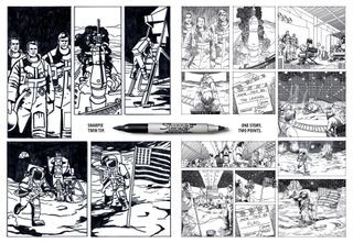 Print adverts: Sharpie
Pen giant Sharpie has a history of producing memorable printed ads, consistently adapting to evolving design trends. This printed ad campaign, created by Brazilian agency FCB, promotes a new Sharpie pen with two points, using the tagline “One Story. Two Points.” The printed ads cleverly employ a comic book art style to depict a major news story from two contrasting perspectives, mirroring the dual-point functionality of the pen. The engaging comic book execution draws the viewer in and encourages interaction, posing the question: “Which side will you believe?” This printed ad campaign demonstrates how brands can leverage popular visual styles like comic art in printed ads to promote product features in a fun and engaging way.
10. Burger King’s Veggie Burger: Meaty Trick
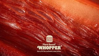 Burger King ad showing a close-up of a vegetable designed to resemble meat
Burger King’s 2022 printed ad campaign for its plant-based burger uses visual deception to create intrigue and challenge perceptions. At first glance, the printed ad appears to be a macro close-up of raw red meat. However, closer inspection reveals that it is actually composed of vegetables – peppers, beetroot, and radicchio – meticulously arranged to mimic the texture and appearance of meat. The tagline, “Sorry for the confusion, meat lovers,” playfully acknowledges the visual trickery and invites consumers to question their assumptions about plant-based alternatives. This printed ad campaign is a masterclass in visual marketing, using surprise and humor to promote a new product and generate buzz. It was even nominated for a CB at 10 Award as the best printed ad of the decade, highlighting its impact and memorability.
11. McDonald’s: Fast Food, Fast Motion
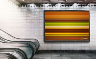 A McDonald
McDonald’s is legendary for its iconic printed ads, and this campaign further solidifies their reputation for creative advertising. This printed ad campaign, designed by No Fixed Address creative agency, features stylized, high-speed renderings of McDonald’s iconic burgers. Despite the extreme motion blur, represented by simple horizontal lines, the products remain instantly recognizable due to their iconic shapes and colors. This ingenious printed ad plays on the concept of “fast food” in a literal and visually striking way, emphasizing speed and recognizability. It showcases the power of iconic imagery in printed ads, proving that even minimalist designs can be incredibly effective in brand communication.
12. Burger King: Flame Grilled Mishaps
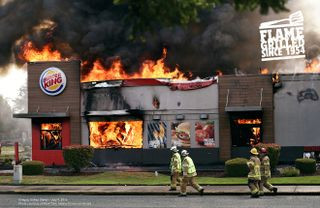 Print adverts: Burger King
Burger King’s commitment to flame-grilling their burgers is a core brand differentiator, and this printed ad campaign by DAVID Miami humorously embraces the potential downsides of cooking with fire. The printed ads feature genuine photos of Burger King restaurants that have caught fire, a self-deprecating approach that is both unexpected and memorable. By highlighting Burger King’s record for restaurant fires (the most since 1954), the printed ad cleverly reinforces their flame-grilling process while injecting humor and authenticity into the brand narrative. This printed ad campaign is a brilliant example of how brands can use self-awareness and even past missteps to create engaging and shareable printed ads.
13. KFC: FCK – A Chicken Shortage Apology
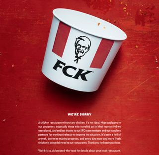 Print adverts: KFC running out of chicken
In 2018, KFC faced an unprecedented crisis: they ran out of chicken in the UK, forcing temporary closures of most of their 900 restaurants. KFC’s response was a masterclass in crisis communication, particularly their printed ad apology created by Mother London. The printed ad simply rearranged the KFC logo to read “FCK,” acknowledging the expletive that many customers were likely thinking, followed by a sincere and humorous apology for the chicken shortage. This printed ad went viral instantly and earned a Wood D&AD Pencil in writing for advertising, demonstrating the power of directness, humor, and humility in printed ads, especially during times of brand crisis.
14. KFC vs. Ikea: Brand Banter
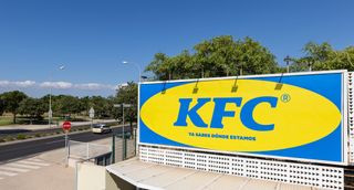 KFC Ikea billboard
When KFC opened a new restaurant in Majorca, Spain, in an area known as “where Ikea is,” they cleverly leaned into the local reference with a playful printed ad campaign. Madrid agency PS21 mimicked Ikea’s iconic color scheme and typography for the KFC printed ads, creating a humorous brand rivalry. This printed ad campaign sparked online “brand banter” between KFC and Ikea, generating buzz and engagement for both brands. It illustrates how printed ads can be used to tap into local contexts and engage in lighthearted competition with other brands for attention and brand awareness.
15. Ikea iDealisk: Cheese Grater Mac Pro
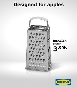 Print adverts: Ikea
When Apple unveiled its new Mac Pro in 2019, its design was quickly compared to a cheese grater online. Ikea Bulgaria swiftly responded with a witty printed ad campaign created by The Smarts advertising studio. The printed ad featured Ikea’s iDealisk kitchen grater alongside the tagline, “Get the Mac Pro look for less,” directly referencing the online comparisons. This printed ad campaign capitalized on a trending internet meme to playfully poke fun at Apple while highlighting Ikea’s affordable design solutions. It’s a prime example of how printed ads can be incredibly timely and reactive, leveraging current cultural conversations for effective marketing.
16. Pepsi: Tastes OK vs. Tastes Better
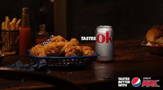 An advert for Pepsi Max Australia that shows a Coca-Cola can with the phrase
Pepsi and Coca-Cola have a long-standing, playful rivalry, and this printed ad campaign from Pepsi Max Australia is a masterclass in subtly clever competitive marketing. Known for their tagline “Tastes Better,” Pepsi flipped the script for this campaign, suggesting that in comparison, Coca-Cola is merely “ok.” The printed ad cleverly uses Coca-Cola’s own packaging design against them, highlighting the “ok” portion of the Coca-Cola logo to imply inferiority. This printed ad campaign is a risky but ultimately genius strategy, using competitor’s branding to subtly promote Pepsi’s superiority. It demonstrates how printed ads can be used for sophisticated brand comparisons and competitive messaging.
17. McDonald’s: Optical Illusion Arches
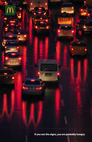 McDonald
McDonald’s utilized optical illusions in this printed ad campaign to create a memorable and subliminal message about hunger. The printed ad depicts a traffic jam at night, with car taillights creating reflections on the road. However, upon closer inspection, the reflections subtly form the iconic McDonald’s Golden Arches. The text in the bottom right corner reads, “If you see the signs, you are probably hungry,” creating a playful and subconscious connection between hunger and the McDonald’s brand. This printed ad campaign demonstrates how optical illusions can be effectively integrated into printed ads to create engaging visuals and deliver subtle marketing messages.
18. Staedtler: Pencil Lead Buildings
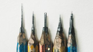 Staedtler print ad showing buildings carved into pencil lead
This printed ad campaign for Staedtler pencils, created by Leo Burnett Hong Kong, utilizes hyper-realistic imagery and optical illusion to showcase the precision and quality of their drafting pencils. The printed ad initially appears to show sharpened pencils with unusually shaped leads. However, a closer look reveals that the “leads” are actually incredibly detailed miniature buildings carved into the pencil lead itself. This visual feat directly relates to the tagline, “Tools for a draftsman,” highlighting the precision and artistry enabled by Staedtler pencils. This printed ad campaign is a stunning example of how intricate visuals and optical illusions can be used in printed ads to emphasize product quality and craftsmanship.
19. Hiper Centro Corona: Kitchen Illusion
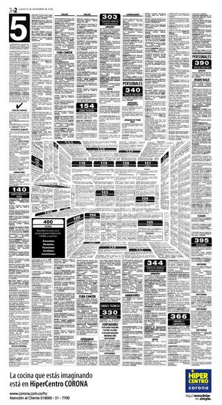 The print ad designs
Hiper Centro Corona, a Colombian home improvement chain, used optical illusion in their printed ads to creatively showcase their kitchen offerings. Designed by Felipe Salazar, the printed ad initially resembles a classified ad page. However, the arrangement of the text and negative space cleverly forms the shape of a kitchen, complete with an extractor fan and countertops. This optical illusion immediately grabs attention and directly relates the ad’s visual to the product being advertised – kitchens. This printed ad campaign effectively demonstrates how optical illusions in printed ads can be used to create engaging and thematically relevant visuals, transforming mundane formats like classified ads into eye-catching marketing tools.
20. Jeep: See What You Want to See
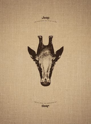 Print adverts: See what you want to see
Jeep’s printed ad campaign, created by Leo Burnett France, plays on the brand’s adventurous spirit and the idea of limitless possibilities. Each printed ad features an image of an animal that, when turned upside down, transforms into a different animal from a geographically opposite region. For example, a giraffe becomes a penguin, an elephant becomes a swan, and a doe becomes a sea lion. The tagline, “See what you want to see,” reinforces the message that with a Jeep, you can explore any terrain and experience diverse environments. This printed ad campaign utilizes reversible imagery and visual transformation to effectively communicate Jeep’s brand identity and adventurous positioning.
21. Mandevu Beard Care: Flipped Perspectives
 An advert for Mandevu, one of the best Print adverts:
Mandevu, a brand specializing in “haircare for beards,” employed visual distortion in their printed ads to grab attention and challenge conventional beauty standards. Created by Creative Y&R agency, the printed ad campaign features images of men with their facial features flipped – their beards placed on their heads, and their head hair styled as beards. This unusual and slightly unsettling visual immediately captures the viewer’s attention and highlights the brand’s focus on beard care in a memorable and unconventional way. This printed ad campaign demonstrates how visual disruption and unconventional imagery can be used in printed ads to promote niche products and challenge audience perceptions.
22. Marmite: Breakfast Means Breakfast
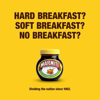 Print adverts: Marmite
Marmite, known for its polarizing “love it or hate it” flavor, cleverly used current events and wordplay in this printed ad campaign to connect with their audience. The printed ad references Brexit, a highly divisive topic in the UK, with the tagline “Breakfast means breakfast.” This simple statement plays on the political debates surrounding the meaning of “breakfast” in the Brexit context, drawing a parallel to Marmite’s equally divisive nature. Created by Oliver agency, this printed ad is a timely and witty example of how brands can leverage current cultural conversations in printed ads to create relatable and shareable content.
23. RBH: Copywriter Needed Pictograms
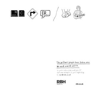 Print adverts: RBH
This recruitment printed ad for RBH advertising agency uses pictograms in a clever and self-referential way to attract copywriters. The printed ad visually spells out “Copywriter needed” using pictograms, highlighting the importance of words in a visually dominated world. The ad copy further reinforces this message, stating, “The pictures people have taken over. We need a words person.” This printed ad is a meta-advertisement, using visual communication to emphasize the value of copywriting and directly appeal to its target audience – wordsmiths. It demonstrates how printed ads can be used for creative and targeted recruitment.
24. Opel: SMS Mistype – Don’t Type and Drive
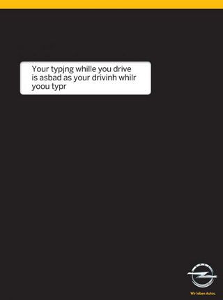 Print adverts: type and drive
Opel, in collaboration with Gitam BBDO agency, created a simple yet powerful printed ad campaign to raise awareness about the dangers of texting while driving. The printed ad visually replicates a phone screen with a black background and a white text box. The text box displays a garbled message – an SMS mistype – visually representing the distraction and potential for error caused by texting while driving. This printed ad campaign uses minimalist design and relatable visual language to effectively communicate a critical safety message.
25. Feltrinelli Books: Reading Means Resisting Distractions
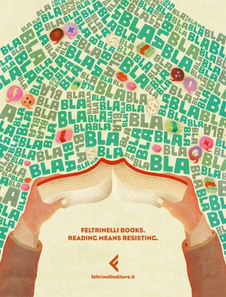 Prints adverts: Feltrinelli books
Feltrinelli books used illustration in their printed ads to promote the immersive power of reading in a world full of distractions. The printed ad features a charming illustration of a person engrossed in a book, surrounded by chaotic and distracting elements that are visually blocked out by the act of reading. The tagline, “Reading Means Resisting,” directly addresses the challenge of maintaining focus in a busy world and positions reading as an act of resistance against distractions. Created by Tita advertising agency, this printed ad campaign beautifully visualizes the escapism and focus offered by books.
26. Marmite: Don’t Forget It – Neglected Jars
 Print adverts: Marmite
Marmite’s printed ads often play on the brand’s polarizing nature and sometimes negative perceptions. This printed ad campaign, created by Adam&EveDDB, addresses another consumer behavior associated with Marmite: buying a jar and then forgetting about it in the back of the pantry. The printed ads adopt the visual language of charity campaigns, aiming to “raise awareness” of “woefully neglected Marmite jars” across Britain. This humorous and self-aware printed ad campaign turns a potential product weakness – infrequent use – into a source of brand humor and engagement.
27. McCann Bristol: Hungry Copywriter – Minimalist Job Ad
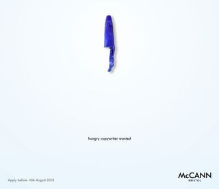 Print adverts: McCann Bristol
McCann Bristol advertising agency created a highly effective and minimalist printed ad to recruit a new copywriter. The printed ad is strikingly simple, featuring the headline “Hungry Copywriter” and minimal text containing only essential information. This job ad is a masterclass in brevity and impactful design, demonstrating the agency’s own copywriting skills while attracting potential candidates. This printed ad campaign serves as a self-promotional piece, showcasing the agency’s creative capabilities while fulfilling its recruitment purpose.
28. Absolut Vodka: Kiss With Pride – LGBTQ+ Equality
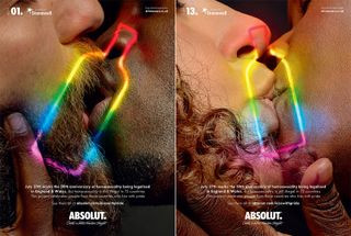 Print adverts: Absolut
Absolut Vodka, in collaboration with Stonewall LGBTQ+ charity and BBH London agency, created a thought-provoking printed ad campaign highlighting LGBTQ+ rights and global inequality. The printed ads feature close-up photographs of same-sex couples kissing, with many of the subjects originating from countries where same-sex relationships are criminalized. This printed ad campaign uses powerful and intimate imagery to raise awareness about LGBTQ+ discrimination and advocate for equality. It demonstrates how printed ads can be used to promote social causes and spark important conversations.
29. Sea Shepherd: You Eat What They Eat – Ocean Plastic
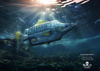 Print adverts: You eat what they eat
Ogilvy Germany created a hard-hitting printed ad campaign for Sea Shepherd Conservation Society (SSCS) to raise awareness about ocean plastic pollution. The printed ads depict various fish species with their bodies grotesquely deformed by plastic objects, visually representing the ingestion of plastic by marine life. The stark tagline, “You eat what they eat,” directly connects the issue of ocean plastic to human health and encourages viewers to take action. This printed ad campaign uses disturbing imagery to effectively communicate the severity of ocean plastic pollution and motivate donations to Sea Shepherd.
30. PNET Job Portal: A Better Job Is Waiting – Mouldy Workers
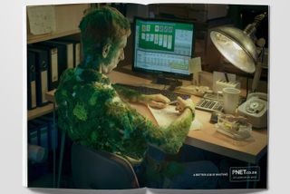 Print adverts: a better job is waiting
This printed ad campaign for PNET job portal, created by Joe Public United, uses surreal and unsettling imagery to motivate people to seek better career opportunities. The printed ads feature retouched photos of office workers who appear to have been sitting at their desks for so long that mould has started to grow on them, or spiders have built webs on their bodies. This exaggerated visual metaphor powerfully conveys the feeling of stagnation and dissatisfaction in a dead-end job. The tagline, “A Better Job is Waiting,” offers a direct solution and encourages viewers to use the PNET job portal. This printed ad campaign employs shock value and dark humor to effectively promote a job search platform.
31. Penguin Audiobooks: Save Paper – Tree Bark Illustration
 Print adverts: Save paper
Penguin Books, in a surprising move, promoted their audiobook offerings by directly addressing environmental concerns about paper consumption. Miami Ad School created this printed ad campaign that features a beautifully detailed illustration of a tree trunk, with the bark intricately designed to resemble an ear. The tagline, “Save paper,” directly promotes audiobooks as an eco-friendly alternative to printed books. This printed ad campaign is both visually appealing and conceptually clever, turning a potential brand conflict (selling books vs. saving paper) into a smart marketing message.
32. Moms Demand Action: Choose One – Gun Control
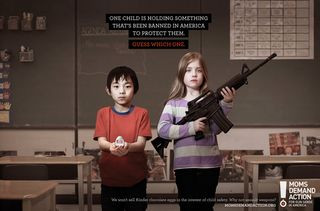 Print adverts: Moms Demand Action
Grey Canada created a hard-hitting printed ad campaign for Moms Demand Action, a gun control advocacy group, using stark comparisons to highlight gun violence in schools. The “Choose One” printed ads feature images of children holding either a weapon or an object banned in the US for child safety, such as Kinder Surprise eggs, Little Red Riding Hood books (due to perceived basket risk), or dodgeballs. The printed ad campaign directly confronts the issue of gun control by contrasting the perceived dangers of everyday objects with the accessibility of assault weapons, prompting viewers to question societal priorities regarding child safety.
33. J. Walter Thompson: #FTHEPAYGAP – Gender Pay Equality
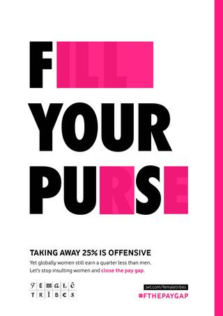 Print adverts: the pay gap
J. Walter Thompson agency created a clever and provocative printed ad campaign to address the gender pay gap. The printed ads take common campaign slogans related to women’s empowerment and strategically block out letters to reveal aggressive and offensive phrases. This visual disruption highlights the underlying sexism inherent in the gender pay gap, suggesting that paying women less than men is equally offensive as overtly sexist language. This printed ad campaign is part of JWT’s “Female Tribes” initiative, aiming to challenge cultural narratives around women’s equality in the workplace.
34. States United to Prevent Gun Violence: Holes – Bullet Impact
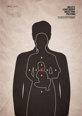 Print adverts: Holes
Grey New York agency created a powerful and disturbing printed ad campaign for States United to Prevent Gun Violence, focusing on the far-reaching impact of gun violence. The printed ads feature a single bullet target superimposed over images of three human figures, including a baby, visually representing the ripple effect of a single bullet. The tagline, “Bullets leave bigger holes than you think,” emphasizes the devastating consequences of gun violence beyond the immediate victim. This printed ad campaign uses stark imagery and emotional appeal to advocate for stricter gun control laws in the US.
35. FedEx: Minimalist Package – Human Logistics
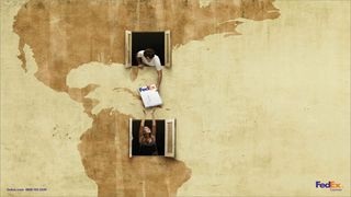 Print adverts: FedEx
FedEx, known for its effective advertising, utilized minimalism in this printed ad campaign to humanize their logistics services. The printed ad features a simple image of a FedEx package with a human face subtly incorporated into the design, giving a friendly and approachable feel to the brand. This minimalist approach effectively communicates the human element behind the logistical process, making FedEx seem more relatable and customer-centric. Created by DDB, this printed ad campaign demonstrates the power of minimalist design in creating a strong brand impression.
36. Pantone: Rain Edition – Colorful Rainwater
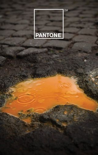 print ads: Pantone
Pantone, the authority on color, collaborated with Italian creatives Giuliano Lo Re and Matteo Gallinelli to create a visually stunning and minimalist printed ad campaign. The “Rain Edition” printed ads feature images of rainwater collected in Pantone-colored containers, highlighting the inherent colors present even in seemingly colorless rainwater. This campaign puts color at the forefront, as expected from Pantone, but in a subtle and unexpected way, exploring the relationship between color and nature. This printed ad campaign is a beautiful example of how minimalist printed ads can be used to showcase a brand’s core product and aesthetic.
37. Kit-Kat: Lockdown Zoom Break
 Kit-Kat
This Kit-Kat concept printed ad, created by Sam Hennig, went viral for its brilliant and timely reflection of lockdown life during the pandemic. The printed ad depicts a daily schedule entirely filled with Zoom meetings, except for two slots in the middle blocked out by a Kit-Kat bar at 3 pm, representing a much-needed break. This minimalist printed ad perfectly captures the essence of “Have a break. Have a Kit-Kat” in the context of endless virtual meetings. Its simplicity, relevance, and on-brand messaging led many to believe it was an official Kit-Kat campaign, demonstrating the power of user-generated content and timely advertising.
38. Norwegian Airlines: Flag of Flags – Hidden Destinations
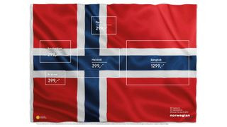 Norwegian Airlines ad
This Norwegian Airlines printed ad, created by M&C Saatchi Stockholm in 2015, resurfaced online and gained renewed appreciation for its clever minimalist concept. Titled “Flag of Flags,” the printed ad subtly incorporates the flags of five countries (including France, Netherlands, and Finland) within the design of the Norwegian flag. The destinations and prices are listed within the flag’s rectangles in a clean sans-serif typeface, creating a visually appealing and informative printed ad. This campaign showcases how minimalist printed ads can be used to creatively highlight multiple destinations and brand attributes.
39. WMF Knife: Sharper Than You Think – Cut Through Anything
WMF, a knife manufacturer, utilized minimalist design to create a striking and impactful printed ad campaign emphasizing the sharpness of their Grand Gourmet knife. The printed ad simply depicts a knife that appears to have effortlessly sliced through the page itself, creating a visually arresting and slightly unsettling image. This minimalist approach directly and powerfully communicates the knife’s sharpness and cutting power without any unnecessary text or imagery. Created by KNSK design agency, this printed ad campaign effectively demonstrates how minimalist printed ads can be used to highlight product features in a dramatic and memorable way.
40. Quebec Automobile Insurance: Buckle Up, Stay Alive – Seatbelt Dates
This printed ad campaign for the Quebec Automobile Insurance Society, created by Lg2 agency, tackles the critical issue of seatbelt safety with a minimalist and emotionally resonant design. The printed ad features a car seat with dates printed on it, representing a driver’s lifespan. The latter date, representing the potential year of death, is partially obscured by the seatbelt, visually demonstrating how a seatbelt can extend life. The tagline, “Buckle Up, Stay Alive,” reinforces this simple yet powerful message. This printed ad campaign effectively uses minimalist design and emotional appeal to promote a vital safety message in a lasting and impactful way.