
While digital advertising dominates today’s marketing landscape, Print Advertisement remains a powerful and effective medium for brands to make a lasting impression. The tangible nature of print, combined with creative visuals and compelling copy, allows for a unique level of engagement that digital ads often struggle to replicate. From classic campaigns that reshaped the advertising industry to modern masterpieces, we explore some of the best print ads ever created, analyzing what makes them work and how they continue to inspire effective print advertisement strategies today.
1. Volkswagen: Think Small, Think Different
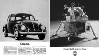 VW advert from the 1960s a VW car and a spaceship
The “Think Small” campaign for Volkswagen, crafted by Doyle Dane Bernbach (DDB) in the 1960s, is more than just an advertising success story; it’s a cultural phenomenon. This series of print advertisement revolutionized the industry by embracing honesty and humor. Instead of trying to compete with larger, more glamorous American cars, Volkswagen ads highlighted the Beetle’s small size and affordability as advantages. Slogans like “Think Small” and “Lemon” (referring to a supposedly defective car, but actually celebrating VW’s rigorous quality control) were groundbreaking. They spoke directly to everyday consumers with relatable problems, setting a new standard for print advertisement that valued clever concepts and audience connection over flashy visuals. The simplicity of the visuals combined with bold, concise copy made these ads instantly recognizable and incredibly effective. This campaign demonstrated the power of understanding your target audience and using print advertisement to build trust and rapport through authentic messaging.
2. Apple: Simplicity is the Ultimate Sophistication
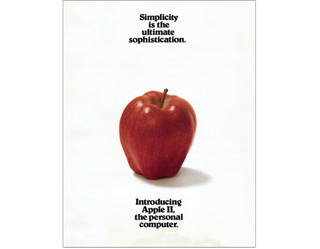 Apple
Apple
Apple’s early print advertisement for the Apple II computer in 1977 perfectly encapsulates the brand’s core philosophy: simplicity and sophistication. This ad is remarkable for what it doesn’t include – no product imagery, minimal text, and a stripped-down aesthetic. By featuring the quote “Simplicity is the ultimate sophistication,” often attributed to Leonardo Da Vinci, Apple positioned itself as a brand that valued elegance and user-friendliness above all else. This print advertisement wasn’t just selling a computer; it was selling an ethos. The bold claim that the Apple II would be “the” personal computer, coupled with the minimalist design, conveyed confidence and innovation. This approach to print advertisement established a visual language for Apple that continues to resonate today, emphasizing the power of understated design and a clear brand identity in print advertisement.
3. Nilkamal Plastic Chairs: Strength in Simplicity
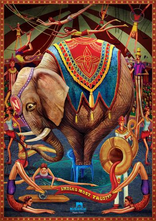 Print adverts: Nilkamal
Nilkamal plastic chairs utilized illustration to create a memorable and impactful print advertisement campaign. The central image of an elephant standing on a single plastic chair instantly communicates the product’s key benefit: strength and stability. The intricate illustration style and vibrant colors elevate the ad beyond a simple product showcase, adding an element of artistry and visual appeal. Created by Makani brand communications agency, this print advertisement cleverly uses humor, evident in the elephant’s slightly apprehensive expression, to further engage the viewer. The absence of lengthy text allows the visual to speak for itself, proving that effective print advertisement can rely on strong imagery and a clear, concise message. This ad exemplifies how illustration can be a powerful tool in print advertisement to convey complex messages with simplicity and charm.
4. Penguin Books: Audiobook Headphones
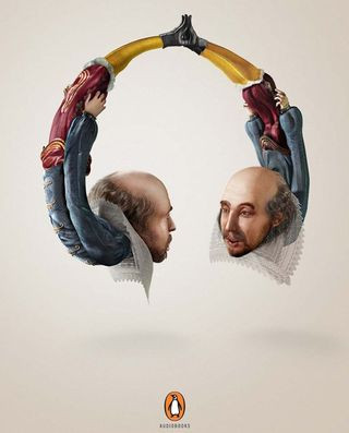 Print adverts: Penguin Books
Penguin Books brilliantly promoted their audiobooks with a series of print advertisement that cleverly visualized the listening experience. By illustrating famous authors – William Shakespeare, Mark Twain, and Oscar Wilde – shaped into headphones, the ads conveyed the immersive nature of audiobooks. This visual metaphor effectively communicated the idea of authors “whispering directly into the ears” of listeners. Developed by McCann India, this campaign received international recognition, winning a Gold Press Lion at the Cannes International Festival of Creativity. The success of this print advertisement lies in its originality and its ability to translate an abstract concept – the audiobook experience – into a tangible and memorable visual. It demonstrates how print advertisement can utilize creative concepts to effectively promote even intangible products or services.
5. SANCCOB: Optical Illusion Penguins
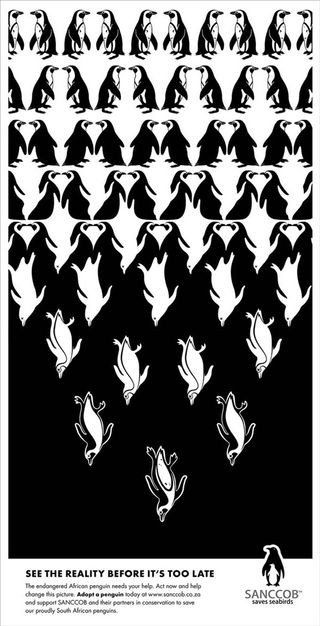 Print adverts: penguin
SANCCOB (Southern African Foundation for the Conservation of Coastal Birds) used the power of optical illusions in their print advertisement to raise awareness about penguin conservation. Inspired by the artwork of M.C. Escher, these ads feature clever visual puzzles that require a second look to fully understand. The campaign, created by McMillan ad agency, presents seemingly abstract patterns that resolve into images of penguins when viewed from different perspectives. This engaging and thought-provoking approach to print advertisement encourages viewers to actively participate in deciphering the message, thereby increasing engagement and recall. By using visual trickery, SANCCOB effectively captured attention and communicated the need to “See The Reality” of penguin conservation, highlighting the potential of print advertisement to create impactful social awareness campaigns.
6. Wacom Bamboo: Creativity Has No Boundaries
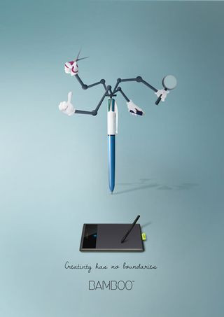 Print adverts: Wacom
Wacom’s print advertisement campaign for their Bamboo series, designed by Maria Molina, artfully promotes the boundless nature of creativity. Under the tagline “Creativity has no boundaries,” the campaign features illustrations of design tools with unexpected, almost fantastical functionalities, reminiscent of Inspector Gadget. The bright colors, minimal text, and simple graphics create a visually striking and easily digestible message. This print advertisement effectively conveys the idea that Wacom tablets empower users to push creative limits. The campaign’s strength lies in its visual wit and its ability to communicate the product’s benefits through imaginative imagery rather than lengthy descriptions, showcasing how print advertisement can leverage visual storytelling to resonate with creative audiences.
7. Schusev State Museum of Architecture: Discover the Full Story
 Print adverts: Schusev State Museum of Architecture
The Schusev State Museum of Architecture used print advertisement to entice audiences to delve deeper into the stories behind Russia’s iconic buildings. Saatchi & Saatchi created a visually stunning campaign featuring illustrations of famous landmarks like St. Basil’s church, extending the imagery below ground level to reveal hidden depths. The tagline “Discover the full story” perfectly complements the visual concept, suggesting that the museum offers a comprehensive understanding of Russian architecture beyond the surface level. This print advertisement campaign relies on the power of evocative imagery to pique curiosity and communicate the museum’s value proposition. The beautiful illustrations, combined with a compelling tagline, demonstrate how print advertisement can effectively promote cultural institutions by appealing to intellectual curiosity and visual aesthetics.
8. Fevikwik Instant Adhesive: Sticky Situation
 Print adverts: Sticky ad
Ogilvy’s print advertisement for Fevikwik Instant Adhesive is a masterclass in minimalist yet impactful advertising. This monochrome, illustration-based ad is part of a three-part series that showcases the adhesive’s strength through clever visual metaphors. The simple, almost cartoonish style combined with the monochrome palette enhances the ad’s memorability and impact. The absence of color and detailed imagery focuses attention on the core message: Fevikwik’s powerful bonding capabilities. This print advertisement demonstrates that effective advertising doesn’t always require complexity. Sometimes, a simple, well-executed concept in print advertisement can be more powerful and memorable than elaborate designs.
9. Sharpie: Two Points of View
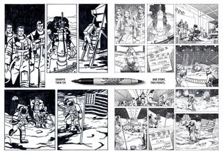 Print adverts: Sharpie
Sharpie’s print advertisement campaign, created by FCB Brazil, cleverly promoted their dual-tipped pen with the tagline “One story. Two Points.” Using a comic book art style, the ads present a news story from two contrasting perspectives, mirroring the pen’s two different points. This creative approach to print advertisement not only highlights the product’s unique feature but also engages the viewer with a mini-narrative. The comic book execution adds a playful and attention-grabbing element to the ad. By linking the product feature to a storytelling device, Sharpie created a memorable and engaging print advertisement campaign that effectively communicated the pen’s versatility and sparked viewer interest.
10. Burger King’s Veggie Burger Trick: Meat the Peppers
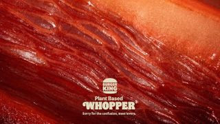 Burger King ad showing a close-up of a vegetable designed to resemble meat
Burger King’s 2022 print advertisement for their veggie burger is a brilliant example of visual deception and playful marketing. At first glance, the ad appears to be a macro close-up of red meat, designed to entice meat lovers. However, upon closer inspection, it’s revealed to be a composition of peppers, beetroot, and radicchio. The tagline “Sorry for the confusion, meat lovers” adds to the humorous and self-aware tone. This print advertisement cleverly uses visual trickery to generate curiosity and highlight the meat-like appearance of their veggie burger. The campaign’s nomination for a “CB at 10 Award” as the best print advertisement of the decade speaks to its effectiveness and innovative approach to promoting a vegetarian option within a fast-food context.
11. McDonald’s Fast Food Blur: Speed and Iconography
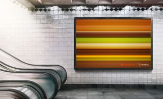 A McDonald
McDonald’s, renowned for its iconic print advertisement, delivers another winner with this minimalist yet instantly recognizable ad. Created by No Fixed Address agency, this print advertisement features blurred images of McDonald’s iconic burgers, rendered as horizontal lines to convey speed and efficiency. Despite the extreme simplification, the products remain easily identifiable due to their strong brand recognition. This campaign demonstrates the power of iconic imagery in print advertisement. By stripping down the visuals to their most basic elements, McDonald’s reinforces brand recognition and subtly communicates the “fast food” concept. This ingenious print advertisement proves that sometimes less is truly more, especially when leveraging established brand iconography.
12. Burger King’s Flame-Grilled Reality: Embrace the Burn
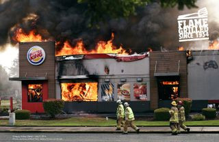 Print adverts: Burger King
Burger King’s “Flame Grilled” print advertisement takes a bold and humorous approach by embracing a potential brand weakness – their history of restaurant fires. DAVID Miami agency ingeniously used genuine photos of Burger King restaurants engulfed in flames to emphasize their flame-grilling cooking method. This self-deprecating print advertisement is both unexpected and memorable. By turning a potential negative into a marketing strength, Burger King demonstrates confidence and a willingness to be unconventional. This campaign highlights the power of authenticity and humor in print advertisement, showing that brands can connect with audiences by being honest and even a little bit self-critical.
13. KFC’s FCK Apology: Owning the Oops
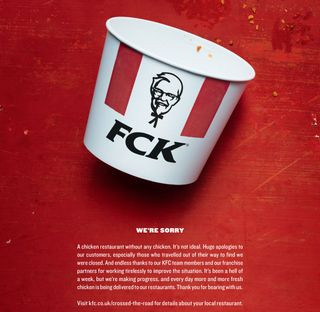 Print adverts: KFC running out of chicken
KFC’s “FCK” print advertisement is a case study in how to handle a brand crisis with grace and humor. When KFC ran out of chicken in the UK in 2018, they responded with a full-page print advertisement that simply rearranged their logo to read “FCK.” This bold and honest apology, created by Mother London, went viral and earned widespread praise. The ad’s effectiveness lies in its brevity, honesty, and humor. By directly addressing the issue with a touch of self-deprecation, KFC turned a potential PR disaster into a brand-building moment. This print advertisement demonstrates the power of transparency and humor in crisis communication and how print advertisement can be used to rebuild brand trust and reputation.
14. KFC vs. IKEA Billboard Banter: Location, Location, Location
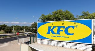 KFC Ikea billboard
KFC Spain’s billboard print advertisement cleverly leveraged its location near an IKEA store to engage in playful brand banter. PS21 Madrid agency mimicked IKEA’s signature color scheme and typography for the KFC ad, directly referencing the area known as “where Ikea is.” This location-specific print advertisement generated buzz and social media engagement through its clever and humorous brand rivalry. By tapping into local context and mimicking a well-known brand’s visual identity, KFC created a memorable and shareable print advertisement that showcased its playful brand personality and localized marketing strategy.
15. IKEA iDealisk: Taking a Bite Out of Apple
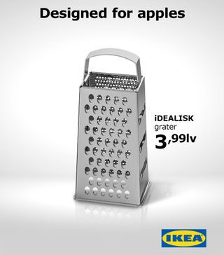 Print adverts: Ikea
IKEA Bulgaria’s “iDealisk” print advertisement is a masterclass in reactive marketing and witty brand commentary. When Apple’s new Mac Pro was released in 2019 and drew comparisons to a cheese grater, IKEA swiftly responded with this ad. Created by The Smarts advertising studio, the print advertisement featured their “iDealisk” kitchen grater with the tagline subtly mocking Apple with a lowercase “i” in the product name. This timely and humorous print advertisement capitalized on a trending topic and showcased IKEA’s quick wit and brand relevance. It demonstrates how print advertisement can be used for real-time marketing and to inject humor into brand messaging by cleverly reacting to cultural moments.
16. Pepsi’s “Tastes OK” Coca-Cola Troll: Packaging as a Punchline
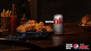 An advert for Pepsi Max Australia that shows a Coca-Cola can with the phrase
Pepsi Max Australia’s “Tastes ok” print advertisement is a prime example of competitor-focused marketing executed with clever simplicity. Building on Pepsi’s long-standing “Tastes better” tagline, this campaign subtly suggests that Coca-Cola is merely “ok” in comparison. The ad cleverly uses the design flaw in Coca-Cola’s packaging to its advantage, letting the rival product’s own branding become the punchline. This print advertisement demonstrates a bold and risky strategy of directly comparing to competitors in print advertisement. By leveraging a visual quirk of the competitor’s product, Pepsi created a memorable and impactful ad that subtly reinforces its brand superiority narrative.
17. McDonald’s Optical Illusion Arches: Hunger Cues on the Road
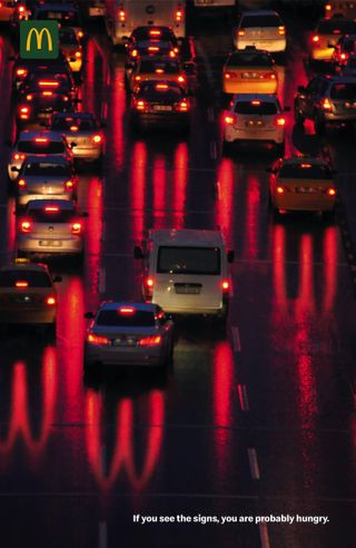 McDonald
McDonald’s “Optical Illusion” print advertisement cleverly plays on subliminal messaging and visual perception. The ad depicts a highway traffic jam at night, with car taillights reflecting on the road. Upon closer inspection, the reflections subtly form the iconic Golden Arches. The text “If you see the signs, you are probably hungry” reinforces the subliminal message. This print advertisement uses optical illusion to create a memorable and engaging visual experience. By embedding the brand logo within a realistic scene, McDonald’s subtly triggers hunger cues and reinforces brand association in a clever and non-intrusive way, demonstrating the power of subtle print advertisement techniques.
18. Staedtler Pencil Buildings: Sharpening Architectural Vision
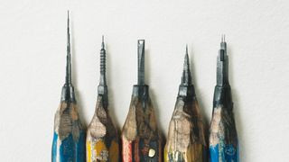 Staedtler print ad showing buildings carved into pencil lead
Staedtler pencils’ print advertisement, created by Leo Burnett Hong Kong, is a stunning example of intricate artistry and product demonstration. The ad initially appears to show sharpened pencils, but closer inspection reveals impossibly detailed buildings carved into the pencil lead. This visual feat directly showcases the precision and sharpness of Staedtler pencils, targeting draftsmen and architects. This print advertisement uses visual hyperbole to emphasize product quality in a highly creative and memorable way. The intricate detail and unexpected execution make this print advertisement stand out, demonstrating how visual artistry can effectively promote product attributes in print advertisement.
19. Hiper Centro Corona’s Kitchen Illusion: Dream Kitchen Classifieds
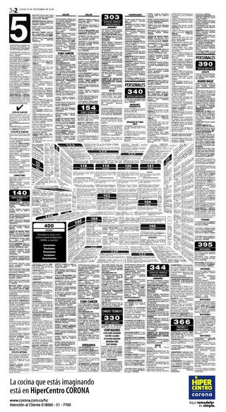 The print ad designs
Hiper Centro Corona’s print advertisement, designed by Felipe Salazar, utilizes optical illusion to promote their kitchen offerings in a unique and engaging way. The ad appears to be a page of classified ads, but the layout and text are cleverly arranged to form the shape of a kitchen, complete with appliances. This visual puzzle requires active engagement from the viewer to decipher the message. This print advertisement effectively combines information with visual intrigue, making the ad both informative and entertaining. By transforming a standard classified ad format into an optical illusion, Hiper Centro Corona created a memorable and interactive print advertisement that effectively showcases their kitchen product range.
20. Jeep’s “See What You Want to See”: Perspective and Possibility
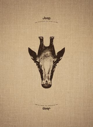 Print adverts: See what you want to see
Jeep’s “See What You Want to See” print advertisement campaign, by Leo Burnett France, plays on the brand’s adventurous spirit and the idea of limitless possibilities. Each ad features an animal image that, when turned upside down, transforms into another animal from a different part of the world. This visual metaphor conveys Jeep’s ability to take you anywhere and experience different perspectives. This print advertisement uses reversible imagery to communicate the brand’s core value proposition of freedom and exploration. The clever visual trick and the tagline work together to create a memorable and thought-provoking print advertisement that resonates with Jeep’s target audience.
21. Mandevu Beard Haircare: Flipped Focus
 An advert for Mandevu, one of the best Print adverts:
Mandevu beard haircare’s print advertisement, created by Creative Y&R, uses visual inversion to grab attention and highlight the product’s focus. The ads feature models with their facial features flipped, placing their beard on their head and head hair as their beard. This unusual and slightly unsettling imagery instantly captures the viewer’s attention and emphasizes the brand’s dedication to beard care. This print advertisement uses visual disruption to break through advertising clutter and create a memorable impact. The unexpected imagery effectively communicates the brand’s unique selling proposition – specialized haircare for beards – in a visually arresting way.
22. Marmite’s “Breakfast Means Breakfast”: Polarizing Humor
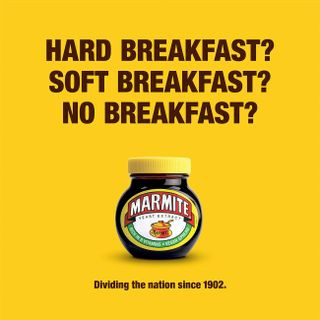 Print adverts: Marmite
Marmite’s “Breakfast Means Breakfast” print advertisement leverages the brand’s polarizing nature and the UK’s political climate with witty humor. The ad references the divisive Brexit referendum, comparing its impact to Marmite’s “love it or hate it” reputation. Created by Oliver agency, this print advertisement taps into current cultural conversations and uses Marmite’s established brand personality to create a relevant and humorous message. This campaign demonstrates how print advertisement can be used to engage with current events and leverage brand identity to create timely and culturally relevant messaging, even if slightly controversial.
23. RBH Recruitment Ad: Words Matter
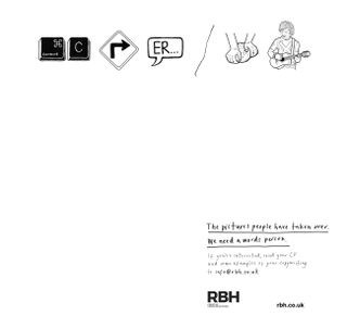 Print adverts: RBH
RBH’s “Copywriter Needed” print advertisement is a clever recruitment ad that highlights the importance of copywriting in a visually driven world. Using pictograms to spell out “Copywriter needed,” the ad emphasizes that “The pictures people have taken over. We need a words person.” This print advertisement is self-referential and directly addresses the target audience – copywriters – in a creative and engaging way. By using a visual puzzle to convey a text-based message, RBH effectively demonstrates the value of words and attracts potential copywriter candidates through clever print advertisement.
24. Opel Road Safety Ad: SMS Mistype Danger
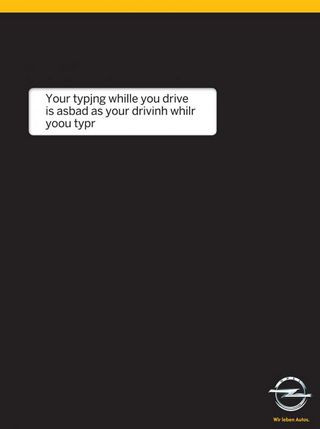 Print adverts: type and drive
Opel’s road safety print advertisement, created by Gitam BBDO, effectively communicates the dangers of texting while driving with a simple yet impactful visual. The ad replicates a phone screen with a mistyped SMS message, highlighting the potential for errors and accidents when distracted driving. The black background and prominent white text box enhance the visual impact and mimic a phone interface. This print advertisement uses a relatable scenario – SMS mistyping – to underscore the serious consequences of distracted driving, making the road safety message both clear and memorable in print advertisement.
25. Feltrinelli Books “Reading Means Resisting”: Escape into Books
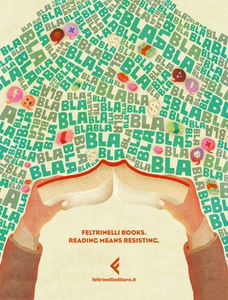 Prints adverts: Feltrinelli books
Feltrinelli books’ print advertisement, created by Tita agency, beautifully illustrates the escapism and focus that reading provides in a distracting world. The ad depicts a person immersed in a book, effectively blocking out the surrounding distractions. The tagline “Reading Means Resisting” reinforces the idea that reading is an act of mindful resistance against external noise. This print advertisement uses illustration to evoke emotion and communicate the intangible benefits of reading, such as focus and escapism. By visually representing the act of immersing oneself in a book, Feltrinelli effectively promotes the value of reading in print advertisement.
26. Marmite’s “Don’t Forget It”: Charity-Inspired Humor
 Print adverts: Marmite
Marmite’s “Don’t Forget It” print advertisement campaign continues to leverage the brand’s self-aware humor and penchant for addressing its less positive associations. Adam&EveDDB agency created a series of ads that mimic charity campaign language to address the “problem” of forgotten jars of Marmite in British homes. This humorous approach to print advertisement acknowledges a common consumer behavior and turns it into a lighthearted marketing message. By playing on charity tropes, Marmite creates a memorable and shareable print advertisement campaign that reinforces brand recognition and encourages consumption through gentle humor.
27. McCann Bristol’s “Hungry Copywriter”: Job Ad Simplicity
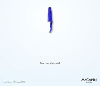 Print adverts: McCann Bristol
McCann Bristol’s “Hungry Copywriter” print advertisement for a job opening is a brilliant example of concise and effective recruitment advertising. The ad uses minimal design elements – a pun, eye-catching layout, and essential application information – to create a striking and informative message. This self-promotional print advertisement demonstrates the agency’s copywriting skills and their ability to communicate effectively with minimal elements. By creating a job ad that is itself a testament to good copywriting, McCann Bristol effectively attracts potential candidates and showcases their agency’s expertise through print advertisement.
28. Absolut’s “Kiss with Pride”: Thought-Provoking Kisses
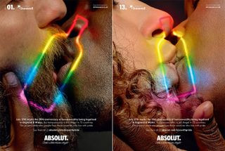 Print adverts: Absolut
Absolut’s “Kiss with Pride” print advertisement campaign is a powerful and thought-provoking social commentary on LGBTQ+ rights. In collaboration with Stonewall and BBH London, Absolut featured close-up shots of same-sex kisses, highlighting the fact that homosexuality is still illegal in many countries. This print advertisement uses emotionally resonant imagery to raise awareness about human rights issues and align the brand with a message of inclusivity and acceptance. By using print advertisement to address a sensitive social issue, Absolut demonstrates brand values and contributes to a larger cultural conversation about equality and human rights.
29. Sea Shepherd’s “You Eat What They Eat”: Ocean Plastic Reality
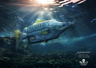 Print adverts: You eat what they eat
Sea Shepherd Conservation Society’s “You eat what they eat” print advertisement campaign, by Ogilvy Germany, powerfully addresses the devastating impact of ocean plastic pollution. The ads depict fish misshapen by plastic objects they have ingested, with the stark tagline “You eat what they eat.” This visually disturbing print advertisement creates an immediate emotional response and connects the issue of ocean pollution to human health. By using impactful imagery and a direct message, Sea Shepherd effectively raises awareness and encourages donations to support their ocean cleanup efforts through impactful print advertisement.
30. PNET Job Portal’s “A Better Job is Waiting”: Mouldy Motivation
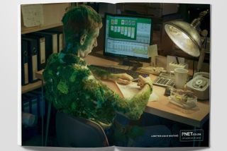 Print adverts: a better job is waiting
PNET job portal’s “A Better Job is Waiting” print advertisement campaign, created by Joe Public United, uses darkly humorous and exaggerated visuals to motivate people to seek new employment. The ads depict bored office workers with mould growing on them or spiderwebs forming, symbolizing stagnation and dissatisfaction in their current jobs. This print advertisement uses shock value and dark humor to grab attention and encourage viewers to consider using the job portal. By employing exaggerated imagery, PNET effectively conveys the message that staying in an unfulfilling job can lead to metaphorical decay, prompting action through print advertisement.
31. Penguin Audiobooks “Save Paper”: Eco-Conscious Promotion
 Print adverts: Save paper
Penguin Audiobooks’ “Save Paper” print advertisement, created by Miami Ad School, takes a counterintuitive approach to promote audiobooks by highlighting the environmental benefits. The ad features an intricate illustration of tree bark, subtly promoting audiobooks as an eco-friendly alternative to paper books. This print advertisement cleverly addresses environmental concerns and positions audiobooks as a sustainable choice. By using print advertisement to advocate for reduced paper consumption, Penguin Audiobooks effectively promotes their audiobook format while appealing to environmentally conscious consumers.
32. Moms Demand Action “Choose One”: Gun Violence Paradox
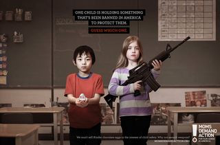 Print adverts: Moms Demand Action
Moms Demand Action’s “Choose One” print advertisement campaign, by Grey Canada, powerfully highlights the paradox of gun laws in the US. The ads juxtapose a child holding a weapon with another child holding items banned in America for child safety, such as Kinder Surprise eggs. The campaign starkly points out the illogicality of stricter regulations on toys than on assault weapons. This print advertisement uses direct comparison and emotionally charged imagery to advocate for gun law reform. By highlighting the absurdity of current regulations, Moms Demand Action effectively raises awareness and prompts action against gun violence through impactful print advertisement.
33. JWT’s “#FTHEPAYGAP”: Aggressive Equality
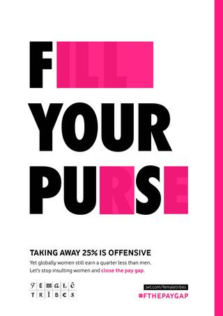 Print adverts: the pay gap
J. Walter Thompson’s “#FTHEPAYGAP” print advertisement campaign directly addresses the gender pay gap with an aggressive and attention-grabbing approach. The ads take campaign messages and block out letters to create alternate, offensive phrases, equating the pay gap to other forms of sexism. This print advertisement uses provocative language and visual disruption to raise awareness about gender inequality in pay. By using bold and confrontational messaging, JWT aims to challenge the cultural narrative around women in the workplace and advocate for equal pay through impactful print advertisement.
34. States United to Prevent Gun Violence “Holes”: Bullet Impact Reality
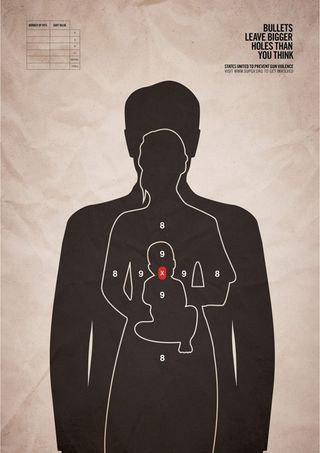 Print adverts: Holes
States United to Prevent Gun Violence’s “Holes” print advertisement campaign, by Grey New York, delivers a hard-hitting message against gun violence. The ads depict a bullet target impacting three human figures, including a baby, emphasizing the wider consequences of gun violence beyond the intended target. The tagline “Bullets leave bigger holes than you think” reinforces the message. This print advertisement uses stark imagery and a direct message to advocate for updated gun laws. By visually representing the far-reaching impact of gun violence, States United effectively raises awareness and calls for action through powerful print advertisement.
35. FedEx Minimalist Package: Human Logistics
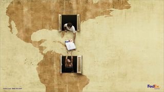 Print adverts: FedEx
FedEx’s minimalist print advertisement campaign focuses on the human aspect of postal logistics. DDB agency created ads that center the FedEx package without being overly promotional, giving a friendly and approachable face to a logistics company. This print advertisement uses simplicity and a focus on the package itself to convey reliability and human connection in delivery services. By humanizing the logistics process, FedEx effectively builds brand trust and communicates its commitment to customer service through understated print advertisement.
36. Pantone Rain Edition: Color in the Mundane
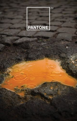 print ads: Pantone
Pantone’s “Rain Edition” print advertisement, a collaboration between Giuliano Lo Re and Matteo Gallinelli, celebrates color in an unexpected context – rainwater. The campaign visually explores the relationship between color and water, showcasing Pantone’s expertise in color and its ability to find beauty in everyday phenomena. This print advertisement uses minimalist design and vibrant colors to emphasize Pantone’s brand identity and its appreciation for color in all aspects of life. By finding beauty in the mundane, Pantone effectively reinforces its brand image and showcases its creative vision through print advertisement.
37. Kit-Kat Lockdown Ad: Relatable Break Time
 Kit-Kat
Sam Hennig’s concept Kit-Kat “Lockdown Ad” brilliantly captures the essence of work-from-home life during lockdowns. The ad depicts a daily schedule dominated by Zoom meetings, with Kit-Kat bars strategically placed to represent break times. This unofficial print advertisement resonated widely online due to its relatability and clever integration of the Kit-Kat brand into the context of lockdown routines. This example demonstrates the power of user-generated content and how brands can benefit from culturally relevant and timely concepts, even in unofficial print advertisement formats.
38. Norwegian Airlines “Flag of Flags”: Hidden Destinations
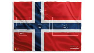 Norwegian Airlines ad
Norwegian Airlines’ “Flag of Flags” print advertisement, created by M&C Saatchi Stockholm, uses visual ingenuity to highlight destinations within the Norwegian flag. The ad cleverly incorporates hidden flags of various countries (France, Netherlands, Finland) within the Norwegian flag design, representing flight destinations. This visually engaging print advertisement is both informative and aesthetically pleasing. By using visual puzzle elements and clean design, Norwegian Airlines effectively promotes its destinations and showcases its international reach through creative print advertisement.
39. WMF Knife “Sharper Than You Think”: Utensil Warning
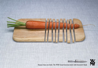 Print adverts: WMF knife
WMF knife’s “Sharper Than You Think” print advertisement, by KNSK agency, uses visual hyperbole to emphasize the extreme sharpness of their Grand Gourmet knife. The ad visually implies an almost dangerous level of sharpness, creating a memorable and slightly intimidating impression. This print advertisement uses exaggeration and visual impact to communicate the product’s key attribute – sharpness – in a striking and unforgettable way. By creating a sense of awe and caution, WMF effectively promotes the quality and power of their knife through print advertisement.
40. Quebec Automobile Insurance “Buckle Up, Stay Alive”: Seatbelt Time Saver
 Print adverts: Quebec Automobile Insurance
Quebec Automobile Insurance’s “Buckle Up, Stay Alive” print advertisement, by Lg2 agency, delivers a powerful road safety message with minimalist design. The ad depicts a car seat with birth and death dates printed on it, the death year covered by the seatbelt, symbolizing how seatbelts can save lives and extend life expectancy. This print advertisement uses visual metaphor and stark simplicity to communicate the life-saving importance of seatbelts. By focusing on the concept of time and life extension, Quebec Automobile Insurance effectively motivates viewers to buckle up through impactful and concise print advertisement.
Conclusion:
These examples demonstrate the enduring power and versatility of print advertisement. From classic campaigns that changed advertising history to modern ads tackling social issues and brand banter, print advertisement continues to offer unique opportunities for creative expression and impactful communication. By understanding the principles of effective print advertisement – strong visuals, compelling copy, clear messaging, and audience relevance – brands can still leverage this medium to create memorable campaigns that resonate with target audiences in a tangible and lasting way. As we move forward in an increasingly digital world, the lessons learned from these exceptional print advertisement examples remain invaluable for marketers seeking to make a real impact.