
Even in our increasingly digital world, Print Ads continue to hold a unique and powerful place in advertising. While it might seem like screens dominate our attention, the tangible nature of print offers a different kind of engagement, allowing brands to make lasting impressions through creative visuals and compelling copy. Just as demonstrated by impactful billboard campaigns, sometimes simplicity and clever messaging are all you need. If you’re seeking inspiration beyond the digital realm, join us as we explore some of the best print ads across decades, revealing the enduring power of ink on paper.
1. Volkswagen: Think Small, Think Different
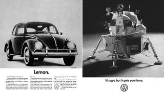 VW advert from the 1960s a VW car and a spaceship
Volkswagen’s “Think Small” ad, showcasing a minimalist approach to car advertising.
(Image credit: VW/DDB)
Revolutionizing the advertising landscape in the 1960s, Volkswagen’s print ads, crafted by Doyle Dane Bernbach (DDB), became iconic for their concept-driven and humorous approach. These ads connected with everyday consumers by acknowledging relatable problems and playing on the Beetle’s unique attributes – its small size, affordability, and unpretentious nature, especially compared to larger, flashier American cars of the time. Simple visuals were paired with impactful, concise copy, slogans like “Think Small” and “Lemon” (used to humorously refer to supposedly faulty cars, turning a potential negative into a memorable positive) became legendary. This campaign demonstrated the power of honesty and wit in print advertising, proving that ads didn’t need to be loud or boastful to be effective.
2. Apple: Simplicity is the Ultimate Sophistication
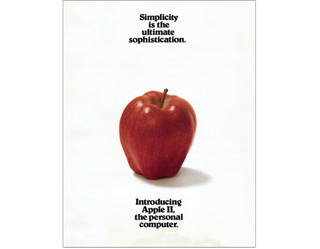 Apple
Apple
Apple’s minimalist print ad from 1977, emphasizing simplicity and sophistication.
(Image credit: Apple)
Apple has long been a master of minimalist marketing, and this print ad from their inaugural 1977 brochure announcing the Apple II computer perfectly embodies their philosophy. Strikingly, the ad features no product imagery. Instead, it opts for a stripped-down aesthetic and minimal copy, quoting “Simplicity is the ultimate sophistication,” a phrase often attributed to Leonardo Da Vinci. This served as more than just a quote; it became the company’s ethos, subtly positioning the Apple II as the personal computer of the future through its promise of user-friendly design and powerful simplicity. This ad exemplifies how print can communicate brand identity and values as much as product features.
3. Nilkamal Plastic Chairs: Strength Illustrated
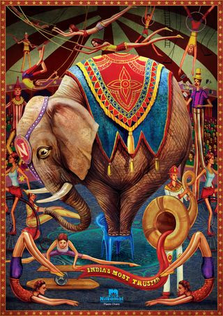 Print adverts: Nilkamal
Nilkamal plastic chairs print ad, using illustration to highlight product strength.
Illustration can elevate advertising concepts, and Nilkamal plastic chairs brilliantly demonstrated this with their print campaign. The ad features an intricately detailed illustration of an elephant standing on one of their plastic chairs. This visual immediately and effectively communicates the product’s key benefit: strength and stability. The detailed illustration style and vibrant colors enhance the ad’s appeal, making it visually engaging and memorable. Created by Makani brand communications agency, the subtle detail of fear in the elephant’s eye, as it balances on the small chair, adds a touch of humor and relatability. This ad is a testament to how powerful and engaging illustration can be in print advertising, especially for conveying product features in a visually striking way.
4. Penguin Books: Audiobook Headphones
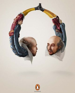 Print adverts: Penguin Books
Penguin Books audiobook ad, cleverly using author illustrations to resemble headphones.
Penguin Books promoted their audiobooks with a clever and visually arresting print ad campaign. The campaign featured illustrations of iconic authors – William Shakespeare, Mark Twain, and Oscar Wilde – cleverly shaped into headphones. This visual metaphor perfectly communicated the idea of listening to these literary giants directly in your ears. Developed by McCann India, this campaign was not only creative but also highly effective, earning a Gold Press Lion at the Cannes International Festival of Creativity. This print ad showcases the power of visual metaphors in conveying a product’s benefit in a memorable and award-winning way.
5. SANCCOB: See the Reality
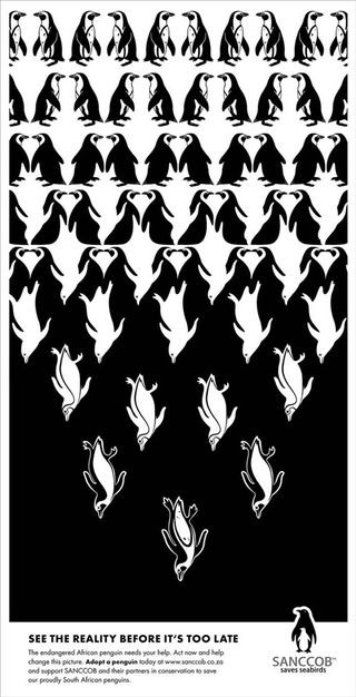 Print adverts: penguin
SANCCOB print ad, employing an optical illusion to highlight the plight of penguins.
SANCCOB (Southern African Foundation for the Conservation of Coastal Birds) utilized print advertising to raise awareness about the realities facing penguins with a visually compelling campaign inspired by M.C. Escher’s artwork. Created by McMillan ad agency, these ads feature clever optical illusions, depicting penguins in ways that highlight their vulnerability and need for conservation. The campaign, while visually intriguing, carries a deeper message about “seeing the reality” of conservation needs. Although some images in the broader campaign contain mature content, the core concept effectively uses optical illusion to draw viewers in and encourage engagement with a serious issue. This example demonstrates how print ads can be used for impactful cause marketing, utilizing art and illusion to convey a powerful message.
6. Wacom Bamboo: Creativity Has No Boundaries
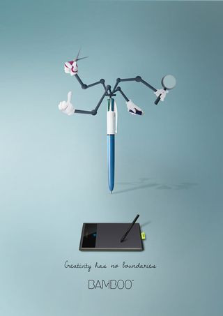 Print adverts: Wacom
Wacom Bamboo print ad, showcasing limitless creativity through imaginative design tools.
To promote their Bamboo series of design tablets, Wacom, a leader in creative technology, launched a print campaign with the tagline “Creativity has no boundaries.” Art director and illustrator Maria Molina developed a series of prints featuring design tools with imaginative and almost fantastical functionality, reminiscent of Inspector Gadget. Bright colors, minimal text, and simple graphics combine effectively to communicate the limitless possibilities of digital creativity facilitated by Wacom products. This campaign is a great example of how print ads can be used to promote technology by focusing on the creative potential it unlocks, rather than just the technical specifications.
7. Schusev State Museum of Architecture: Discover the Full Story
 Print adverts: Schusev State Museum of Architecture
Schusev State Museum of Architecture print ad, revealing hidden depths of Russian landmarks.
The Schusev State Museum of Architecture utilized print advertising to draw visitors in by showcasing the hidden depths of Russian architectural history. Saatchi & Saatchi created a visually stunning campaign featuring illustrations of famous Russian landmarks like St. Basil’s Cathedral in Moscow, extending beneath ground or water level to reveal the “full story” of these iconic structures. The tagline “Discover the full story” invites viewers to explore the museum and learn more about the rich history behind these buildings. The campaign’s strength lies in its captivating imagery, making it a compelling example of how print ads can effectively promote cultural institutions and historical exploration.
8. Fevikwik Instant Adhesive: Sticky Situation
 Print adverts: Sticky ad
Fevikwik Instant Adhesive print ad, using monochrome illustration for a sticky visual pun.
Ogilvy, renowned for creating some of the best print advertising globally, crafted a brilliant series for Fevikwik Instant Adhesive. This particular ad, part of a three-part series, uses clever monochrome illustrations to their full potential. The visual pun is instantly understood – a person stuck in a comical, sticky situation – effectively highlighting the product’s core benefit: strong, instant adhesion. This ad demonstrates how humor and visual wit, combined with a minimalist monochrome palette, can create a highly memorable and effective print ad for a functional product.
9. Sharpie: One Story, Two Points
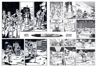 Print adverts: Sharpie
Sharpie print ad, utilizing comic book style to showcase a dual-tipped pen.
Sharpie, a leading pen brand, has a history of producing excellent print ads, consistently keeping pace with design trends. Brazilian agency FCB created a series of clever print ads with the tagline “One story. Two Points” to promote a new dual-tipped pen. The ads employ a comic book art style to depict a news story from two different perspectives, highlighting the pen’s dual functionality in a visually engaging way. The comic book execution adds a playful and dynamic element, effectively capturing attention and showcasing the pen’s unique feature. This campaign illustrates how print can leverage popular art forms to create engaging and product-focused advertising.
Fast Food Print Ads: Clever Bites
10. Burger King’s Veggie Burger Illusion
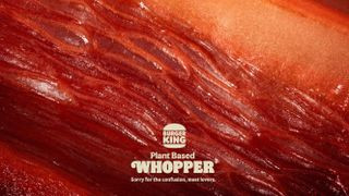 Burger King ad showing a close-up of a vegetable designed to resemble meat
Burger King’s veggie burger ad, using a close-up of vegetables to mimic meat.
(Image credit: Burger King)
Burger King’s 2022 print ad for their veggie burger played a clever trick on the eyes. At first glance, the ad appears to be a macro close-up of red meat. However, upon closer inspection, it’s revealed to be vegetables – peppers, beetroot, and radicchio – meticulously arranged to resemble meat. The tagline, “Sorry for the confusion, meat lovers,” directly addresses the visual deception, creating a memorable and attention-grabbing ad that highlights their plant-based offering in a surprising way. Nominated for a CB at 10 Award as the best print ad of the decade, this ad demonstrates the power of visual trickery and a bit of playful humor in print advertising.
11. McDonald’s: Fast Food in Motion
 A McDonald
McDonald’s print ad, conveying speed and iconicity through blurred burger imagery.
(Image credit: No Fixed Address)
McDonald’s, renowned for its iconic print ads, is a strong contender for advertising champion. This particular print ad, designed by No Fixed Address creative agency, features a blurred array of their iconic burgers, rendered at high speed. Despite the simplistic design – essentially horizontal lines – the products remain instantly recognizable due to their strong brand iconography. This ingenious ad cleverly communicates the concept of “fast food” in a visually dynamic and minimalist way, showcasing the power of brand recognition and simple yet effective design in print advertising.
12. Burger King: Flame Grilled…Maybe Too Much?
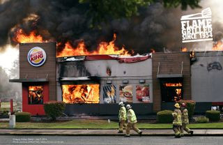 Print adverts: Burger King
Burger King print ad, humorously using real fire mishap photos to emphasize flame-grilling.
Burger King takes pride in flame-grilling their burgers, differentiating themselves from frying methods. However, fire can be unpredictable. DAVID Miami agency seized on this insight, leveraging Burger King’s somewhat unfortunate record of restaurant fires (holding the record for most restaurants burned down since 1954). The print ad uses genuine photos of Burger King locations ablaze to emphasize their flame-grilling process with a humorous twist. The tagline is implied rather than explicitly stated: “Flame Grilled, maybe get a takeaway.” This campaign is a bold example of self-deprecating humor in advertising, using a potential negative to create a memorable and brand-defining print campaign.
13. KFC: FCK – An Apology Done Right
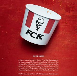 Print adverts: KFC running out of chicken
KFC print ad, a witty apology for running out of chicken, creatively rearranging brand letters.
In 2018, KFC faced an unprecedented crisis: they ran out of chicken in the UK. Faced with temporarily closing most of their 900 restaurants due to distributor issues, KFC responded with remarkable transparency and humor. They enlisted Mother London to create a print ad apology that went viral instantly. The ad simply rearranged the KFC logo to read “FCK,” acknowledging the situation with wit and humility. This print ad is a masterclass in crisis communication, demonstrating how to turn a negative situation into a positive brand moment through humor and honest acknowledgment, earning a Wood D&AD Pencil for writing in advertising.
Brand War Print Ads: Banter and Bites
14. KFC vs. Ikea: Location, Location, Location
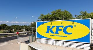 KFC Ikea billboard
KFC billboard ad, mimicking Ikea’s style to playfully acknowledge location near Ikea.
(Image credit: KFC Spain on Twitter)
When KFC opened a new restaurant in Majorca, Spain, in an area locally known as “where Ikea is,” they cleverly leaned into the association. Madrid agency PS21 mimicked Ikea’s iconic color scheme and typography for a print ad to announce the new location. This playful jab led to good-natured “brand banter” between KFC and Ikea, demonstrating how brands can engage in lighthearted competition through print advertising, using humor and brand recognition to their advantage.
15. Ikea vs. Apple: Cheese Grater Chic
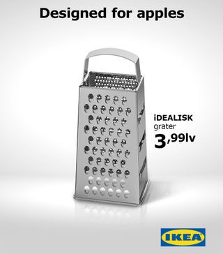 Print adverts: Ikea
Ikea print ad, cheekily comparing their product to Apple’s Mac Pro design.
(Image credit: IKEA)
When Apple unveiled their new Mac Pro in 2019, its design drew comparisons to a cheese grater. Ikea Bulgaria, known for its quick-witted marketing, jumped on the opportunity. Within days, advertising studio The Smarts created a killer print ad comparing an Ikea kitchen utensil to the Mac Pro. The ad cheekily used a lower-case ‘i’ on the product name and a tagline that subtly mocked Apple’s design. This is a prime example of ambush marketing in print, where a brand cleverly inserts itself into a current conversation, leveraging humor and topical references to gain attention and brand recognition.
16. Pepsi vs. Coca-Cola: Taste Test Trolling
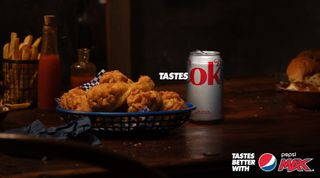 An advert for Pepsi Max Australia that shows a Coca-Cola can with the phrase
Pepsi print ad, subtly suggesting Coca-Cola is just “ok” in a taste comparison.
(Image credit: Pepsi Max Australia)
The playful rivalry between Pepsi and Coca-Cola is legendary in advertising. Pepsi Australia’s print campaign exemplifies effortlessly clever marketing. Known for their “Tastes better” tagline, Pepsi cleverly switched the narrative, suggesting that in comparison, Coca-Cola is merely “ok.” The campaign subtly uses Coca-Cola’s own packaging design to imply inferiority, letting the competitor’s product speak for itself. This is a risky but brilliant strategy, demonstrating how print ads can be used for effective competitive marketing, playing on brand perception and subtle visual cues.
Illusion Print Ads: Seeing is Disbelieving
17. McDonald’s: Optical Illusion Arches
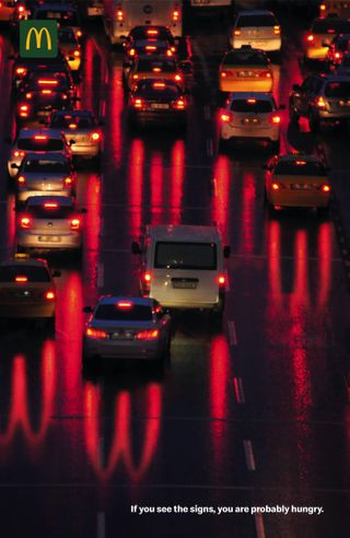 McDonald
McDonald’s print ad, using car headlights and optical illusion to subtly form Golden Arches.
(Image credit: McDonald’s)
McDonald’s created a clever optical illusion print ad featuring a highway traffic jam at night. At first glance, the car headlights appear normal. However, a closer look reveals a subtle optical illusion: the reflections of the red taillights cast spectral Golden Arches onto the road. The text “If you see the signs, you are probably hungry” adds a playful, subliminal message. This ad demonstrates how optical illusions can be used in print to create engaging and memorable advertising, subtly embedding brand imagery into unexpected places.
18. Staedtler: Pencil-Lead Architecture
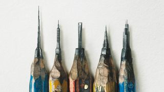 Staedtler print ad showing buildings carved into pencil lead
Staedtler print ad, showcasing intricate buildings carved into pencil lead to highlight precision.
Staedtler pencils, a German brand, created a print campaign via Leo Burnett Hong Kong that leaves a sharp impression. The ad initially appears to show bizarrely sharpened pencils. On closer inspection, it reveals impossibly intricate buildings carved into the pencil lead. This visual feat perfectly communicates the precision and quality of Staedtler pencils, targeting draftsmen and artists. This ad exemplifies how print can be used to showcase product quality and precision through visually stunning and unexpected imagery.
19. Hiper Centro Corona: Kitchen Classified Illusion
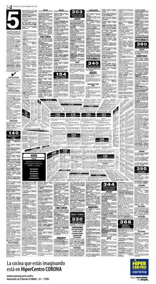 The print ad designs
Hiper Centro Corona print ad, an optical illusion forming a kitchen from classified ad layout.
(Image credit: Felipe Salazar)
Hiper Centro Corona, a Colombian home improvement chain, utilized optical illusion in their print advertising to promote their kitchen offerings. Designer Felipe Salazar created an ad that initially looks like a page of classified ads. However, the layout is meticulously designed to form the shape of a kitchen, complete with an extractor fan and countertops. This clever illusion effectively links the product (kitchens) with the print medium (newspaper classifieds) in a visually engaging and memorable way. This ad demonstrates how print can be used to create interactive and surprising experiences for the viewer.
20. Jeep: See What You Want to See
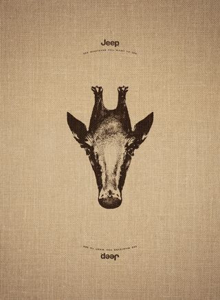 Print adverts: See what you want to see
Jeep print ad, using reversible animal images to represent freedom of exploration.
Jeep’s print campaign, created by Leo Burnett France, plays on the brand’s adventurous spirit with the tagline “See what you want to see.” Each ad features an image of an animal that, when turned upside down, transforms into another animal from a different part of the world: a giraffe becomes a penguin, an elephant a swan, and a doe a sea lion. This visual metaphor effectively communicates Jeep’s brand promise: the freedom to explore and discover, seeing the world from different perspectives. This ad illustrates how print can be used to convey brand values and emotional connections through clever visual storytelling.
21. Mandevu: Flipped Focus on Beards
 An advert for Mandevu, one of the best Print adverts:
Mandevu beard care print ad, flipping facial features to emphasize beard care.
Mandevu, a brand specializing in “haircare for beards,” aimed to bring more attention to beard grooming. Creative Y&R agency created a series of print ads that flip the model’s facial features, placing his beard on his head and his head hair as his beard. This unusual and slightly unsettling visual instantly grabs the viewer’s attention, highlighting the brand’s focus on beard care in a memorable and disruptive way. This ad demonstrates how print can be used for shockvertising and to create immediate visual impact, especially for niche products seeking attention.
Clever Copy Print Ads: Words with Wit
22. Marmite: Breakfast Means Breakfast (Brexit Edition)
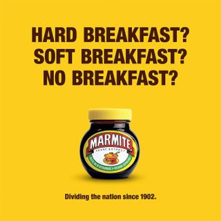 Print adverts: Marmite
Marmite print ad, humorously referencing Brexit to highlight divisive brand nature.
Marmite, known for its “love it or hate it” polarizing flavor, has cleverly carved a niche as shorthand for anything divisive. In the context of Brexit, a highly polarizing event in the UK, Marmite’s ad, created by Oliver agency, was inevitable. The tagline “Breakfast Means Breakfast” plays on the political slogan while humorously referencing Marmite’s own divisive nature. This ad is a timely example of how print can leverage current events and cultural moments to create relevant and witty advertising, reinforcing brand identity through topical humor.
23. RBH: Copywriter Needed (Pictogram Puzzle)
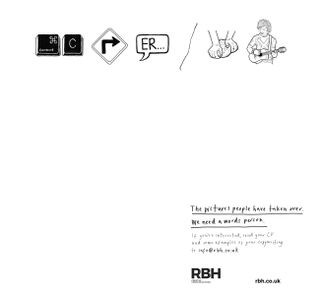 Print adverts: RBH
RBH recruitment print ad, using pictograms to spell out “Copywriter Needed.”
RBH advertising agency created a recruitment print ad for a copywriter with a clever twist on using pictograms. The ad uses illustrated pictograms to spell out “Copywriter needed,” followed by the statement, “The pictures people have taken over. We need a words person.” This ad is a meta-example of effective copywriting within a print ad, highlighting the value of words in a visually driven world. It’s a smart and self-aware way to attract copywriters through the very medium they excel in – print and clever wordplay.
24. Opel: SMS Mistype – Don’t Text and Drive
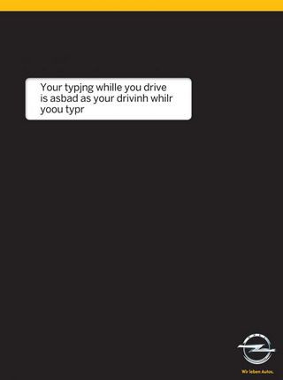 Print adverts: type and drive
Opel road safety print ad, using SMS mistype to emphasize dangers of texting while driving.
Opel, a car manufacturer, partnered with Gitam BBDO agency to create a road safety print ad addressing the dangers of texting while driving. The ad cleverly simulates an SMS text message with a crucial mistype that changes the message entirely, highlighting the potentially fatal consequences of distracted driving. The simple design, black background mimicking a phone screen, and prominent white text box enhance the message’s impact. This ad is a powerful example of how print can be used for public service announcements, using simple but impactful visual and textual elements to convey a critical message.
25. Feltrinelli Books: Reading Means Resisting Distractions
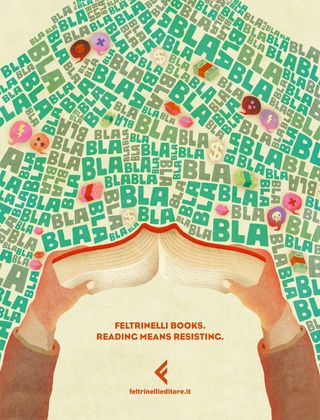 Prints adverts: Feltrinelli books
Feltrinelli Books print ad, illustrating reading as escape from distractions.
Feltrinelli Books, promoted reading with an illustrated print ad campaign created by Tita advertising agency. The ad tackles the common challenge of distractions in modern life. The illustration depicts a person immersed in a book, effectively shutting out the surrounding chaos and distractions. The tagline “Reading Means Resisting” encapsulates this idea, positioning reading as an act of escape and focus. This ad effectively uses illustration and a simple concept to promote the value of reading in a world full of distractions.
26. Marmite: Don’t Forget It – Neglected Jars
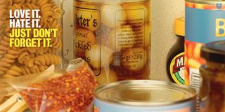 Print adverts: Marmite
Marmite print ad, humorously addressing the issue of forgotten Marmite jars.
Marmite, in another clever print campaign by Adam&EveDDB, addresses a different aspect of its brand: the tendency for people to buy a jar and then forget about it. Playing on charity campaign language, the print ads aim to “raise awareness” of woefully neglected Marmite jars across Britain. This campaign uses humor and relatable consumer behavior to create engaging print ads, reinforcing Marmite’s brand personality and encouraging consumption by reminding people of its presence in their pantries.
27. McCann Bristol: Hungry Copywriter – Job Ad Simplicity
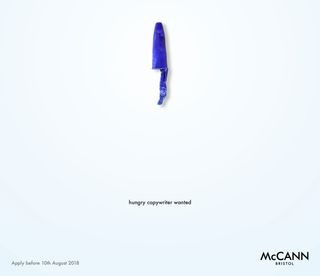 Print adverts: McCann Bristol
McCann Bristol recruitment print ad, a minimalist job ad demonstrating copywriting skills.
When McCann Bristol advertising agency needed a new copywriter, they created a job ad that exemplifies effective print advertising. The minimalist design, clever pun, and eye-catching layout deliver all necessary application information with minimal design elements. The “Hungry Copywriter” headline, combined with concise text, serves as a practical demonstration of excellent copywriting for potential candidates. This ad is a brilliant example of “show, don’t tell,” using the ad itself to showcase the agency’s and the desired candidate’s skills.
Thought-Provoking Print Ads: Messages that Matter
28. Absolut: Kiss with Pride – Love is Love
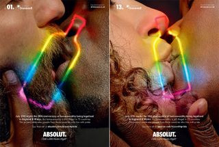 Print adverts: Absolut
Absolut Vodka print ad, promoting LGBTQ+ rights with powerful same-sex kiss imagery.
Absolut Vodka, in collaboration with LGBTQ charity Stonewall and BBH London, created a thought-provoking print campaign highlighting global LGBTQ+ rights. The ads feature close-up shots of same-sex kisses, with many subjects from countries where such displays of affection are illegal or dangerous. The “Kiss with Pride” campaign is a powerful statement of solidarity and advocacy, using print to raise awareness about LGBTQ+ rights and promote inclusivity. This ad demonstrates how brands can use print for social commentary and to support important social causes.
29. Sea Shepherd: You Eat What They Eat – Ocean Plastic Crisis
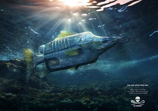 Print adverts: You eat what they eat
Sea Shepherd print ad, highlighting ocean plastic pollution impact on food chain.
Sea Shepherd Conservation Society (SSCS) and Ogilvy Germany partnered to create a print campaign addressing the devastating issue of plastic pollution in oceans. The ads depict various fish misshapen and contaminated by plastic objects, with the stark tagline “You eat what they eat.” This powerful visual and message directly connects consumer actions to the environmental consequences of plastic waste and its impact on the food chain. The ad effectively uses print to raise awareness about environmental issues and encourage donations to Sea Shepherd.
30. Job Portal: A Better Job is Waiting – Career Stagnation
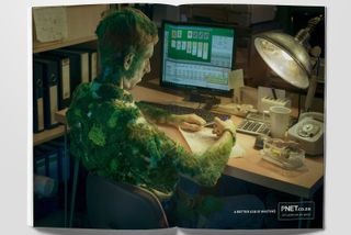 Print adverts: a better job is waiting
Job portal print ad, visually depicting career stagnation and need for change.
A job portal, in a campaign by Joe Public United, aimed to motivate people to leave unfulfilling jobs. The print ads feature retouched photos of bored office workers, depicted as being so stagnant in their roles that mold grows on them or spiders build webs on their desks. The tagline “A Better Job is Waiting” provides a clear call to action. This campaign uses striking and slightly unsettling imagery to address a common feeling of career dissatisfaction and promote the job portal’s services. It demonstrates how print can be used to tap into emotional triggers and encourage personal change.
31. Penguin Audiobooks: Save Paper, Listen to Books
 Print adverts: Save paper
Penguin Audiobooks print ad, promoting audiobooks as eco-friendly paper alternative.
Penguin, a company built on paper books, boldly promoted their audiobook offering through a print campaign by Miami Ad School that directly addresses environmental concerns. The ad features an intricate illustration within tree bark, emphasizing the “Save paper” message and promoting audiobooks as an eco-friendlier alternative to traditional print. This campaign is a clever way for a print-centric company to promote a digital product by aligning it with environmental responsibility, demonstrating that print can be used to advocate for change and new product adoption.
32. Moms Demand Action: Choose One – Gun Control Advocacy
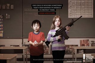 Print adverts: Moms Demand Action
Moms Demand Action print ad, contrasting banned Kinder Eggs with readily available guns.
Moms Demand Action, advocating for gun law reform, partnered with Grey Canada to create a hard-hitting print campaign focused on gun violence in schools. The “Choose One” concept features a child holding a weapon alongside classmates holding items banned in the US for child safety: a Kinder Surprise egg, Little Red Riding Hood, or a dodgeball. The ad asks viewers to guess which item is banned, highlighting the controversial reality of stricter regulations on toys than on assault weapons. This campaign effectively uses print for social activism, raising awareness about gun control issues through stark comparisons and emotionally resonant imagery.
33. J. Walter Thompson: #FTHEPAYGAP – Gender Pay Equality
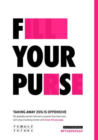 Print adverts: the pay gap
J. Walter Thompson print ad, using redacted text to highlight gender pay gap outrage.
J. Walter Thompson agency created a clever print campaign addressing the gender pay gap. The ads take campaign messages about pay equality and strategically block out letters to reveal aggressive and offensive phrases. This visual redaction technique underscores the message that paying women less than men for equal work is just as offensive as overtly sexist behaviors. The #FTHEPAYGAP hashtag further amplifies the message on social media. This campaign effectively uses print to make a strong statement about gender inequality in the workplace, using visual disruption to draw attention to the issue.
34. States United to Prevent Gun Violence: Holes – Gun Violence Impact
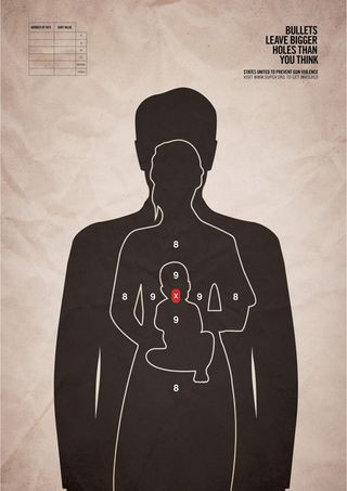 Print adverts: Holes
States United to Prevent Gun Violence print ad, visually representing wider impact of gun violence.
States United to Prevent Gun Violence partnered with Grey New York to create a hard-hitting print campaign against gun violence. The ads feature a single bullet target impacting three human figures, including a baby, visually representing the wider impact of gun violence beyond the immediate target. The tagline “Bullets leave bigger holes than you think” reinforces this message, calling for updated gun laws in the USA. This campaign uses stark and emotionally impactful imagery to advocate for gun control, demonstrating print’s power in conveying serious social messages.
Minimalist Print Ads: Less is More
35. FedEx: Human Logistics
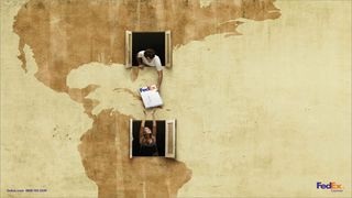 Print adverts: FedEx
FedEx print ad, minimalist design emphasizing human connection in logistics.
FedEx, known for effective advertising, created a minimalist print ad campaign by DDB that focuses on the human side of logistics. The ad subtly features a FedEx package as the central element without being overtly promotional. It successfully humanizes the brand, conveying a friendly and approachable image for a logistics company. This campaign demonstrates how minimalist print ads can effectively build brand image and emotional connection without relying on overt product promotion.
36. Pantone: Rain Edition – Color in the Mundane
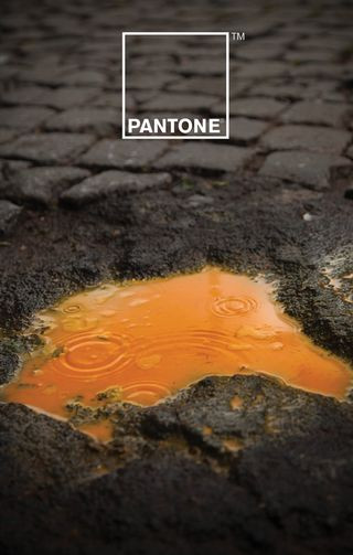 print ads: Pantone
Pantone print ad, minimalist design highlighting color even in rainwater.
Pantone, the authority on color, collaborated with Italian creatives Giuliano Lo Re and Matteo Gallinelli for a minimalist print campaign. The “Rain Edition” focuses on color in an unexpected place: rainwater. Instead of using the typical rainbow imagery associated with color, the campaign explores the subtle colors within rainwater, placing color front and center in a minimalist and sophisticated way. This ad exemplifies how print can be used to showcase a brand’s core identity – in Pantone’s case, color – in a visually refined and conceptually intriguing manner.
37. KitKat: Lockdown Break – Zoom Meeting Fatigue
 Kit-Kat
KitKat concept print ad, minimalist schedule highlighting break time amidst Zoom meetings.
(Image credit: Sam Hennig)
Sam Hennig created a concept KitKat print ad that went viral for its brilliant simplicity and relevance to lockdown life. Made for the One Minute Briefs Twitter account, the ad depicts a daily schedule dominated by Zoom meetings. A KitKat duo cleverly blocks out two slots at 3 pm, representing a much-needed break. This minimalist ad is highly relatable, timely, and perfectly on-brand with KitKat’s “Have a break” slogan. It demonstrates how simple, relevant, and minimalist print ads can resonate deeply with audiences and gain significant attention, even if unofficially created.
38. Norwegian Airlines: Flag of Flags – Destination Hidden in Design
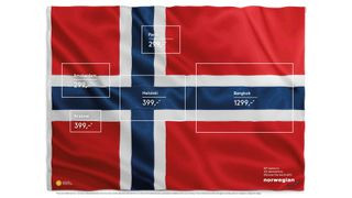 Norwegian Airlines ad
Norwegian Airlines print ad, minimalist design hiding destination flags within Norwegian flag.
(Image credit: Norwegian Airlines)
Norwegian Airlines’ “Flag of Flags” print ad, created by M&C Saatchi Stockholm in 2015 but recently resurfaced online, showcases minimalist genius. The ad subtly incorporates five hidden flags (including France, Netherlands, and Finland) within the Norwegian flag design. The destinations and prices are listed within the flag’s rectangles in a clean sans-serif typeface. This ad is a masterclass in minimalist design and clever visual communication, effectively promoting destinations in an understated and intriguing way.
39. WMF Knife: Sharper Than You Think – Minimalist Threat
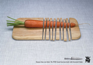 Print adverts: WMF knife
WMF knife print ad, minimalist design emphasizing sharpness and danger.
WMF, a knife brand, created a minimalist print ad by KNSK agency that effectively communicates the sharpness of their Grand Gourmet knife. The ad features a stark white background and a simple, almost threatening visual representation of the knife’s sharpness. The minimalist design and implied danger create a memorable and impactful ad, emphasizing the product’s key feature in a visually striking way. This ad demonstrates how minimalist print can be used to create a sense of power and product superiority through visual understatement.
40. Quebec Automobile Insurance: Buckle Up, Stay Alive – Minimalist Life Dates
 Print adverts: Quebec Automobile Insurance
Quebec Automobile Insurance print ad, minimalist design using life dates on car seat for seatbelt message.
Quebec Automobile Insurance Society, in a campaign by Lg2 agency, addressed driving safety with a minimalist and impactful print ad. The ad depicts a car seat with life dates printed on it, the latter year of death covered by the seatbelt. This simple image powerfully conveys the message that “Seatbelts save lives.” The minimalist design and direct visual metaphor make a lasting impression, effectively promoting seatbelt use in a memorable and emotionally resonant way. This campaign demonstrates how minimalist print can be used for powerful public service messaging, using simplicity to maximize impact.